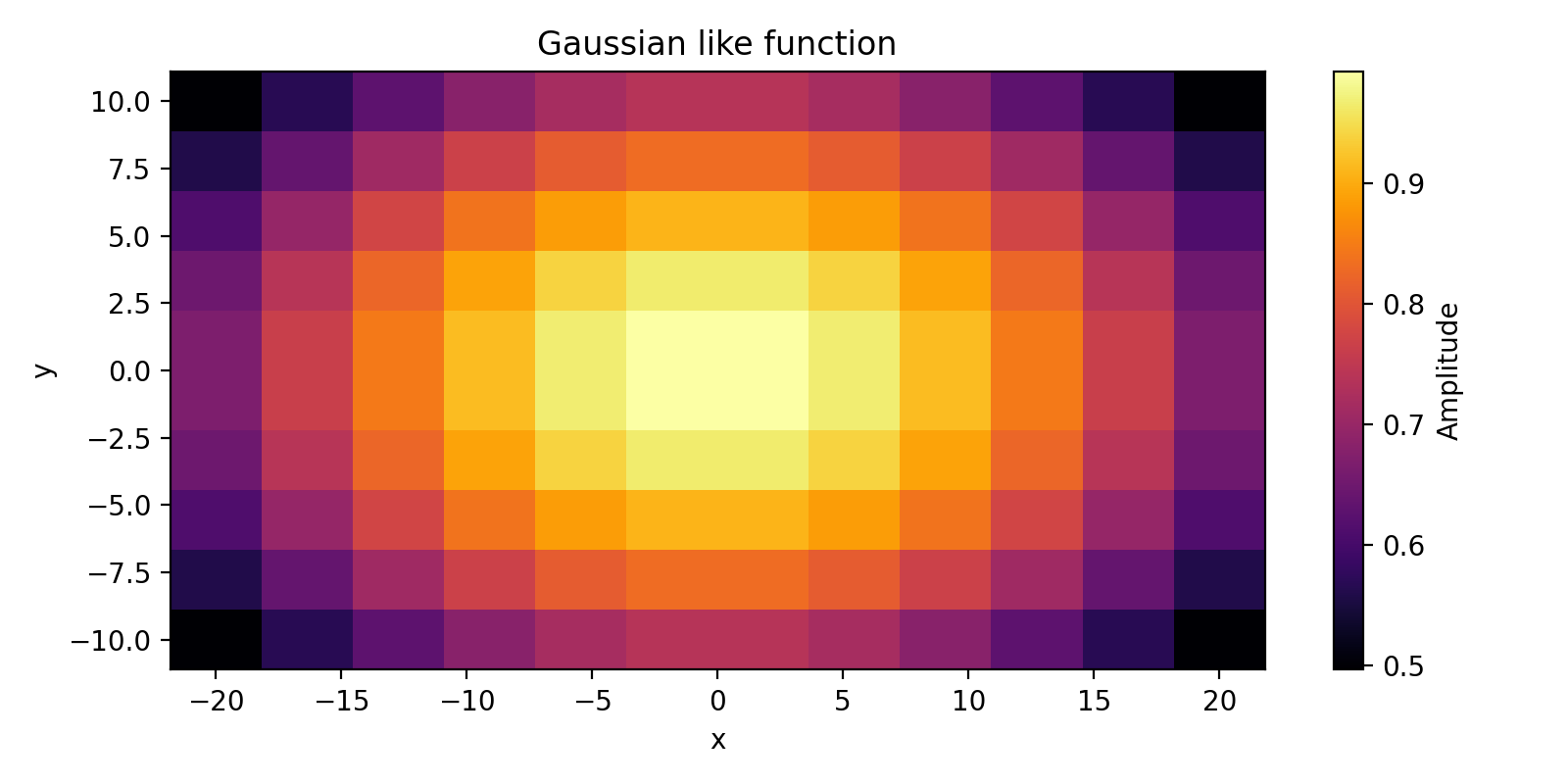
Pcolormesh
Basic example:
import matplotlib.pyplot as plt
import numpy as np

# Creating a 2D
x = np.linspace(-20, 20, num=12)
y = np.linspace(-10, 10, num=10)
x_mesh, y_mesh = np.meshgrid(x, y)
z = np.exp(-1e-3 * x_mesh ** 2 - 3e-3 * y_mesh ** 2)

# Not mandatory as pcolormesh accepts both: center and edges coordinates
# Convert coordinates FROM center TO edge of quadrilaterals
xgap = np.median(x[1:] - x[:-1])
x = np.append(x, x[-1] + xgap) - (xgap / 2)
ygap = np.median(y[1:] - y[:-1])
y = np.append(y, y[-1] + ygap) - (ygap / 2)

fig = plt.figure(figsize=(8, 4), tight_layout=True)
ax1 = fig.add_subplot(111)
pcolor = ax1.pcolormesh(x, y, z, cmap="inferno")
ax1.set_xlabel("x")
ax1.set_ylabel("y")
ax1.set_title("Gaussian like function")
cbar = fig.colorbar(pcolor)
cbar.set_label("Amplitude")
fig.savefig("pcolormesh.png", dpi=200)
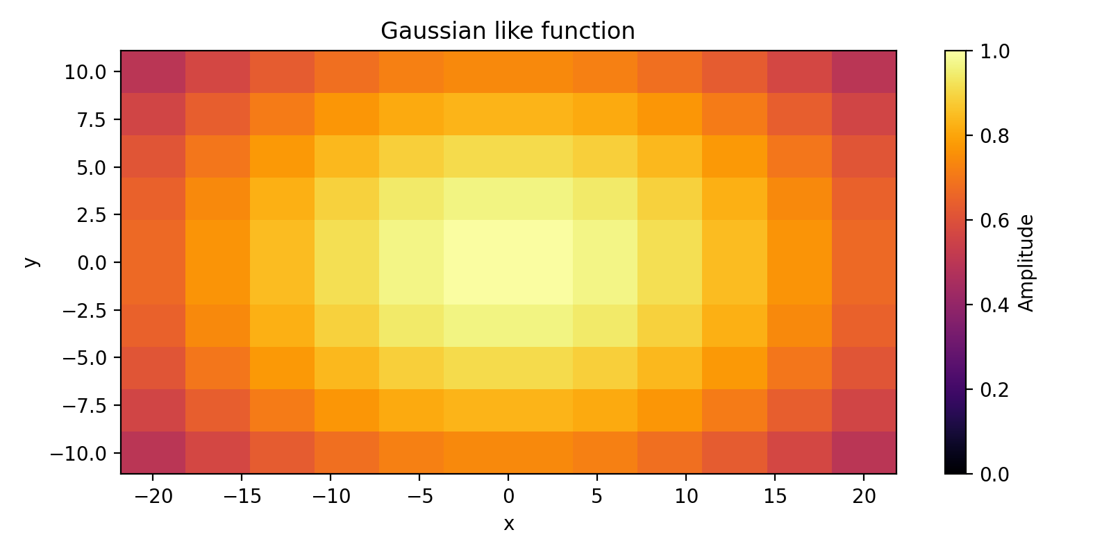
You can choose the range of value of the colormap with arguments vmin and vmax:
fig = plt.figure(figsize=(8, 4), tight_layout=True)
ax1 = fig.add_subplot(111)
pcolor = ax1.pcolormesh(x, y, z, vmin=0, vmax=1, cmap="inferno")
ax1.set_xlabel("x")
ax1.set_ylabel("y")
ax1.set_title("Gaussian like function")
cbar = fig.colorbar(pcolor)
cbar.set_label("Amplitude")
fig.savefig("pcolormesh_v.png", dpi=200)
Sources:
pcolormesh ; matplotlib: https://matplotlib.org/stable/api/_as_gen/matplotlib.axes.Axes.pcolormesh.html